
Welcome to my personal blog—a space where learning feels like catching up with friends.
We’ll master new skills, share our progress, and enjoy every step of the journey.
Regarding my next journey, it will be pl-300 certificated preparation the series. (Microsoft Power BI Data Analyst certification)

Let’s explore, practice, and enjoy this journey together!
Past few weeks, I have learned about data preparation and transformation by Power Query, you can check it out from my pervious blogs, in Learning space category.
Here is the lasted blogs
The current week, we will dive in Data Modeling concept which will help us understand
- Difference between facts and dimensions to design star-schema models.
- How the star and snowflake schemas perform the impact.
- Driving accurate insights by evaluated data model choices.
- Optimize model and visual performance in report.
🧩 What’s data model?
Data model is conceptual view of data elements and visual representation
It contains keys, tables, columns, data types and relationship between tables.
Data modeling is critical part of Power BI that linked tables to find the right insight.
Mainly backstage handled by Power Query for prep the data and manage the queries which drive dashboard and report.
So, data modeling be 80% in Power Query and 20% in Power BI.
💡To see how this all fits together, let’s explore a real dataset.
📖 Load and transform data
Open your power BI desktop
Home > data session > Get data > choose type of your dataset
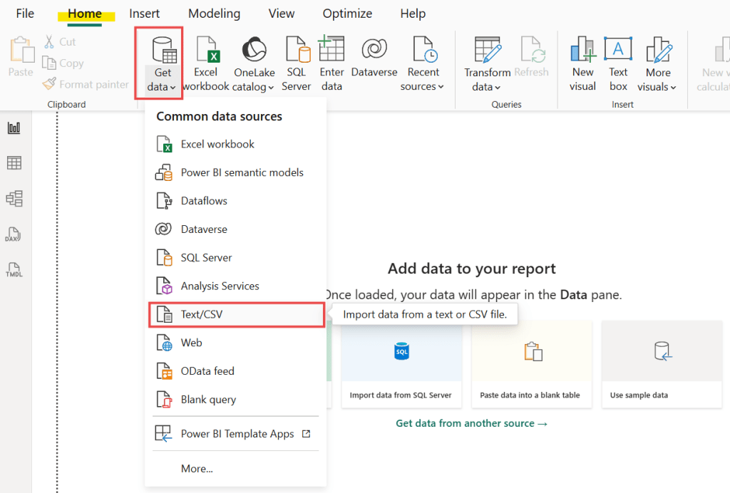
Once your table pop-up click “Transform data” button that will bring you to Power Query.
Data transformation steps you can check it out from my previous blogs as well. That will be explained the area 80% that handle by Power query.
Learning space : https://pelpaths.com/category/learning-space-🪐/
🍟 We will dive into 20% that handle by Power BI
Go the table view on your left hand side >
ribbon bar “table tools” will be pop-up automatically and “Column tools” will be pop-up when you select column and also show the operator sessions.
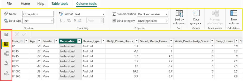
📖 Key Sections of Column Tools
1. Structure (The Identity)
This is where you define what the data is.
- Name: You can rename the column here (e.g., changing “Inv_Date” to “Invoice Date”) to make it friendlier for your report.
- Data Type: This is crucial. You tell Power BI if the column is a Whole Number, Decimal, Text, or Date. Tip: If your “Date” column is set to “Text,” you won’t be able to use time-based filters!
2. Formatting (The Look)
This changes how the data appears in your charts without changing the actual value.
- Format: For numbers, you can choose Currency, Percentage, or Scientific.
- Currency Symbol: If you’re working with Baht, Dollars, or Euros, you set that here.
- Decimal Places: You can clean up your dashboard by limiting numbers to 0 or 2 decimal places.
3. Properties (The Behavior)
This section controls how the column interacts with the rest of the report.
- Data Category: If you have a column with city names, set the category to City. This helps Power BI recognize it’s a location so it can map it correctly.
- Summarization: You can decide if Power BI should automatically Sum, Average, or Count the column when you drag it into a visual.
4. Sort (The Order)
Have you ever had a chart where the months go “April, August, December” (alphabetical) instead of “January, February, March”?
- Sort by Column: This allows you to sort one column based on another. For example, you can sort the “Month Name” column by a “Month Number” column to get the correct chronological order.
🧩 Dimensional Modeling
The Kimball model one of the most popular approached to data modeling.
📖 Key concepts :
Facts : Metrics from business process
Dimensions : Context surrounding a business process
When these key concepts connected will become Star Schema 🌟.

You can see the several dimension surrounding each fact.
This example you will see Sales are stored in facts table and other tables like Sale ID, date, customer and store are provided more context of sales.
🎁 Fact table contains key to establish relationships between tables. Usually it’s long and narrow.
🎀 Dimension table works liked warehouse to organize the story, for example, What, Where, When, Why and Who. Additionally it’s shared the business concepts and contained static or changing data. Usually it’s short and wide but containing large data for fact table.
So, Star schema’s faster and easier to use this model in Power BI.
💡 What is a Relationship?
In the “Star Schema”, a relationship is a link between a Dimension Table and a Fact Table.
🎀 The “Cardinals” (How many connect?)
When you draw a line between tables in Power BI, you’ll see some numbers like 1 and * (which means “Many”). This is called Cardinality.
1. One-to-Many (1:∗) — The Standard
This is the most common and the “healthiest” relationship for Power BI.
- The “1” Side: Usually your Dimension table. Each item appears only once. (e.g., There is only one Customer ID “A101” for Wahn).
- The “Many” (*) Side: Usually your Fact table. That same customer can buy things many times. (e.g., Customer “A101” appears five times in the Sales table because they bought five things).
2. One-to-One (1:1) — The Mirror
Both tables have the same unique items. This is rare. It’s like having one table for “Employee Name” and another for “Employee Phone Number.” Usually, these should just be one big table.
3. Many-to-Many (∗:∗) — The Messy One
This happens when both tables have repeating values.
For beginners, avoid this if possible ‼️
it can make your numbers act very strange and give you incorrect totals.
🎀 The Filter Direction (The “Flow”)
When you look at the relationship line, you’ll see a little arrow. This is the Cross-filter direction.
- Single Direction (One Way): The arrow points from the “1” side to the “Many” side. Rule of Thumb: Your Dimension tables “filter” your Fact tables. If you click on “Year 2024” in your Date table, the arrow carries that filter down to your Sales table to show only 2024 sales.
- Both Directions (Two Way): The filter flows both ways. Be careful! This can slow down your report and cause “ambiguity” (Power BI getting confused about which path to take).
🧩 Star and Snowflake Schemas
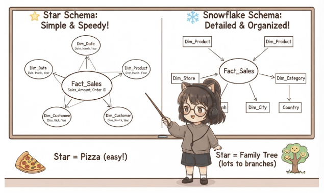
🌟 The Star Schema: Simple & Speedy!
Think of the Star Schema like a pizza. In the very center, you have the main event – your “fact” table (the pizza base with all the toppings like sales amount, quantity sold, etc.). Around it, you have smaller, simpler “dimension” tables (like the crust, cheese, sauce, pepperoni, mushrooms – each is a separate, simple ingredient).
❄️ The Snowflake Schema: Detailed & Organized!
Now, imagine that same pizza, but instead of having all the “toppings” (dimension details) directly on the base, some of them are in smaller, separate bowls that are linked to the main topping.
The Snowflake Schema is like a family tree. The main “fact” table is still at the center, but now some of its “dimension” tables have their own little branches of even more detailed dimension tables. It’s “normalized,” which is a fancy way of saying it’s highly organized to avoid repeating information.
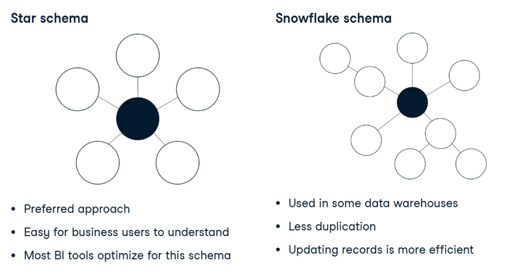
🧐 Star vs. Snowflake: What’s the Difference?
| Feature | Star Schema | Snowflake Schema |
|---|---|---|
| Shape | Central fact table, dimensions directly around. | Central fact table, dimensions branch further. |
| Simplicity | Simpler, fewer tables to join. | More complex, more tables to join. |
| Query Speed | Generally faster for reports. | Can be slower due to more joins. |
| Data Redundancy | Some repetition in dimension tables (e.g., product category repeated for each product). | Less repetition, highly “normalized.” |
| Storage Space | Might use a bit more space (due to repetition). | Uses less space (due to no repetition). |
| Ease for BI | Easier for tools like Power BI to work with. | Can be more complex for BI tools to navigate. |
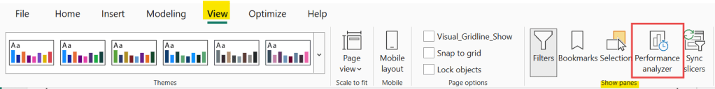
🧩 The performance analyzer
This is built-in performance in Power BI.
Navigate to “View” > Show pane session
it’s felt like it was moving as slow as a turtle, the Performance Analyzer is your best friend.
Think of it like a stopwatch for your report. It measures exactly how many milliseconds each part of your page takes to load, so you can find the “troublemaker” visual that is slowing everyone else down.
⏰ How to use it (3 Simple Steps)
- Open it: Go to the View tab in the top ribbon and check the box for Performance Analyzer. A new pane will pop up on the right.
- Start Recording: Click the Start recording button.
- Interact: Click a slicer, change a page, or click Refresh visuals. You will see a list of every visual on your page appearing in the pane with a timer next to it.
Here is the basic concept for Data Modeling, next week we will deep dive into more details of data model !
Thank you and see you for the next series of learning.🖤

Leave a comment